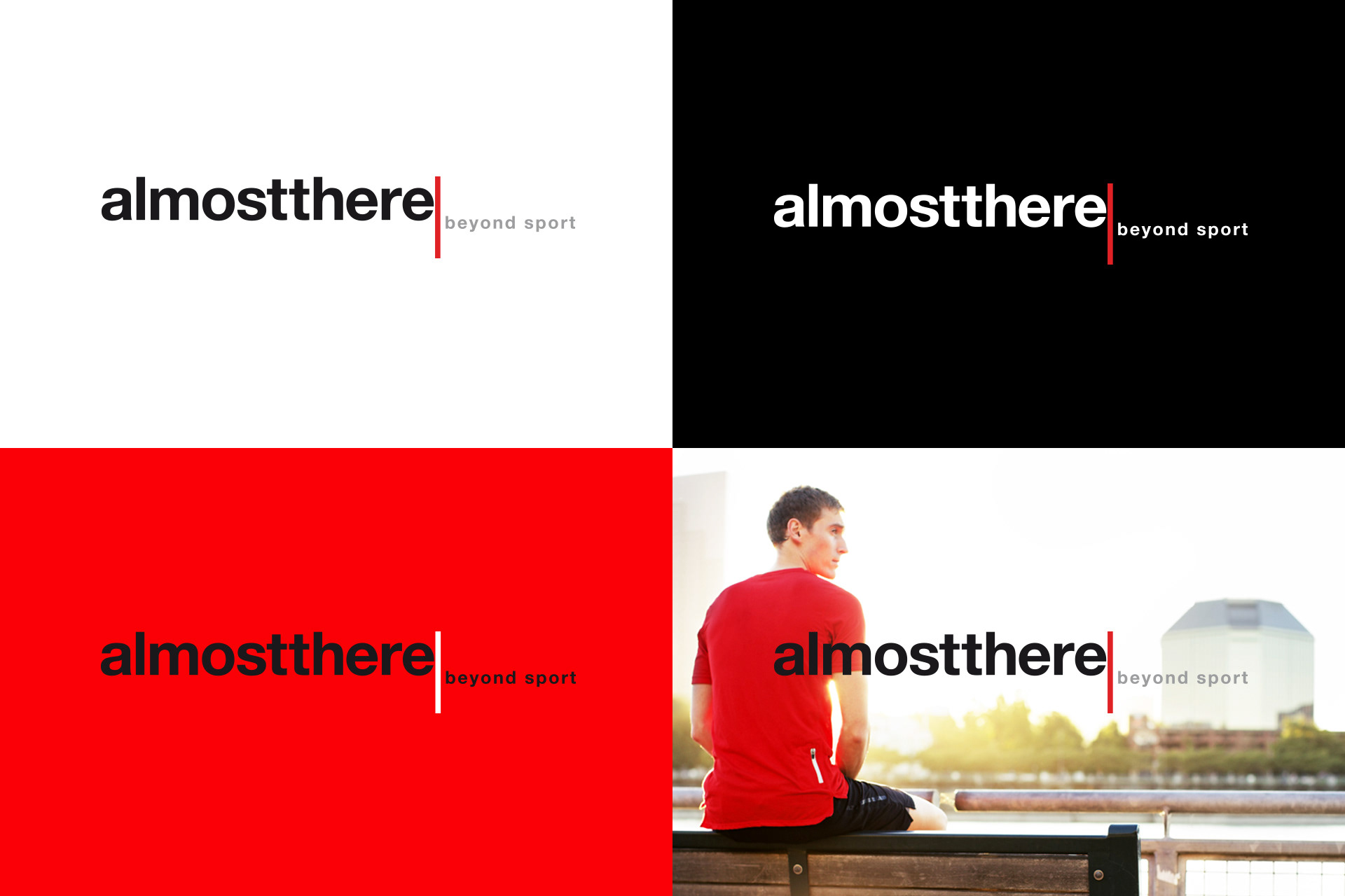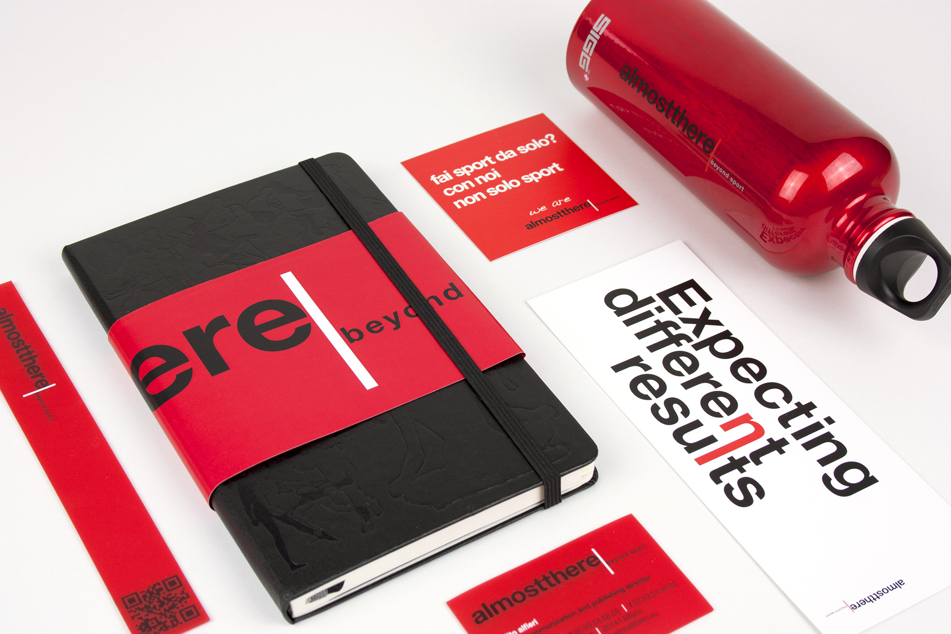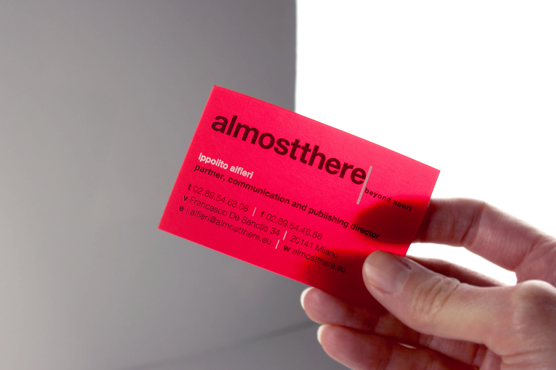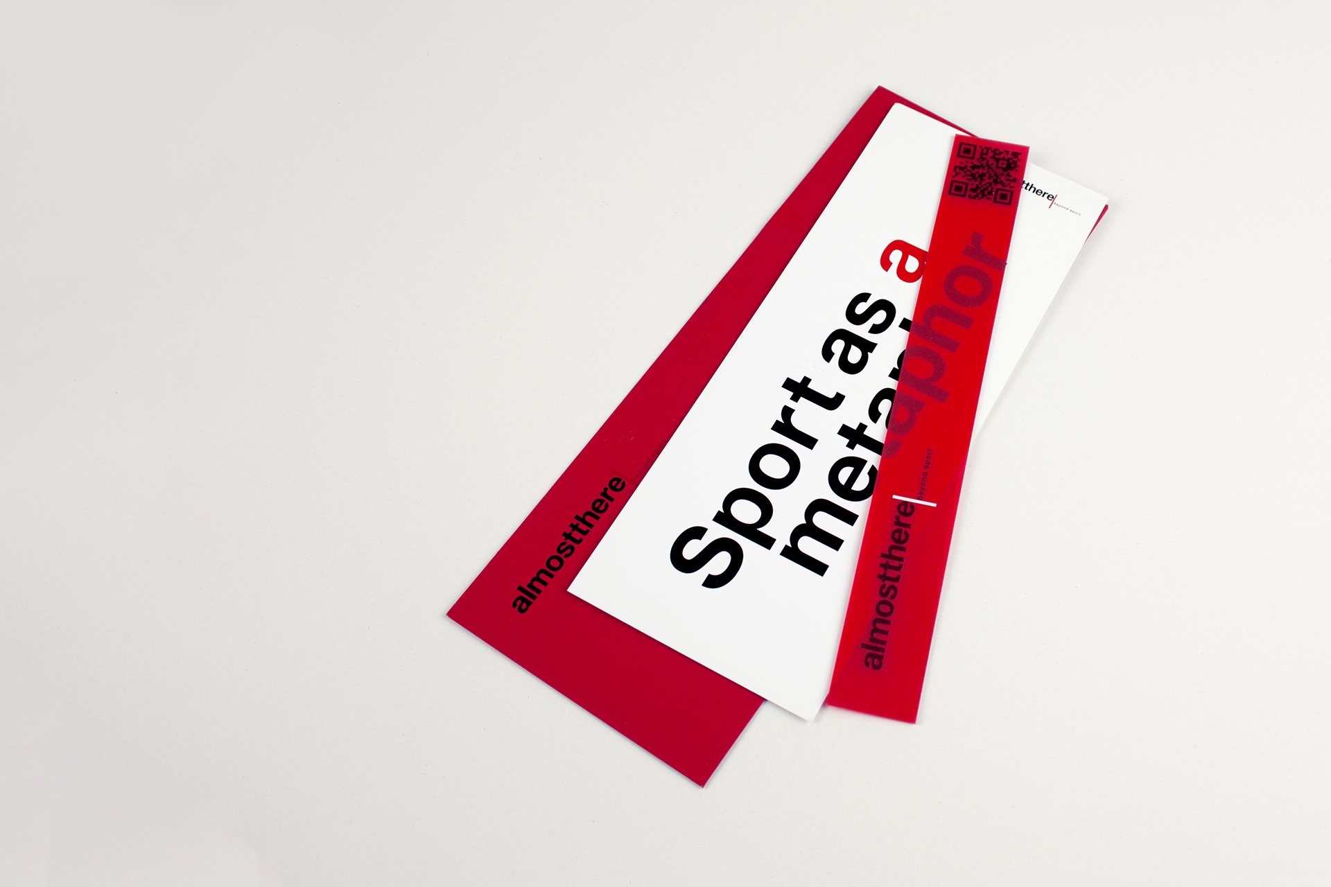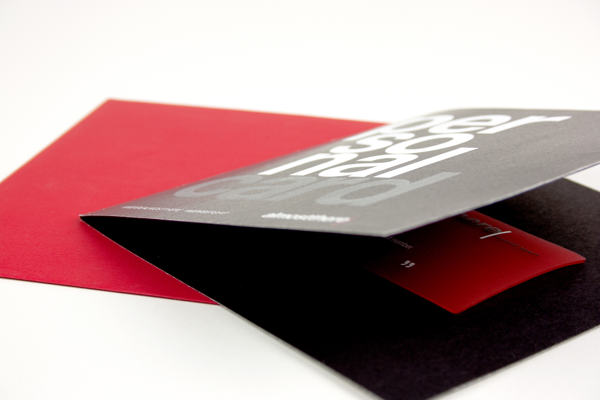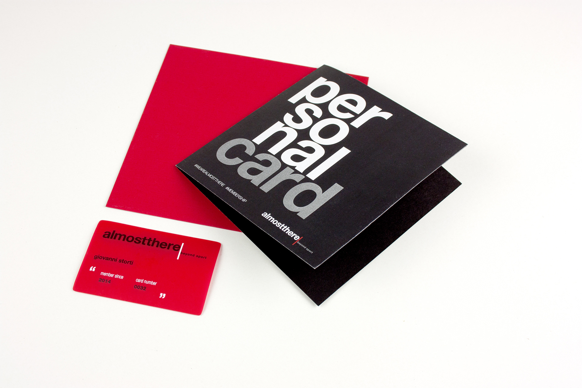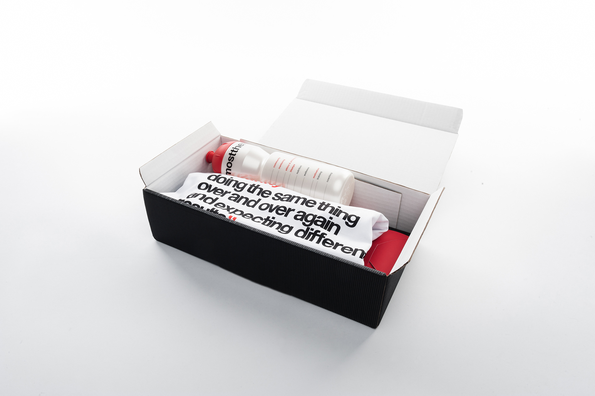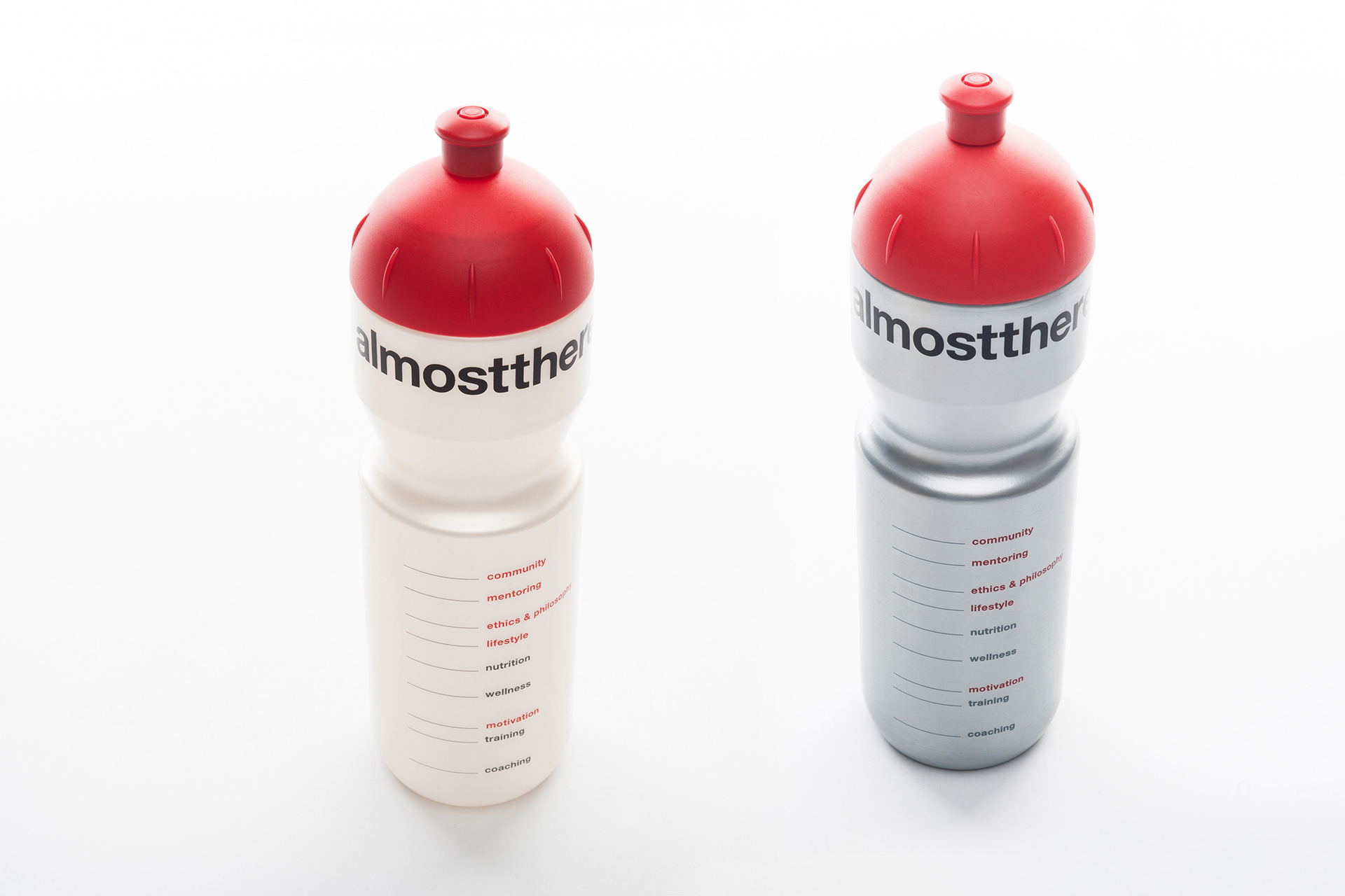
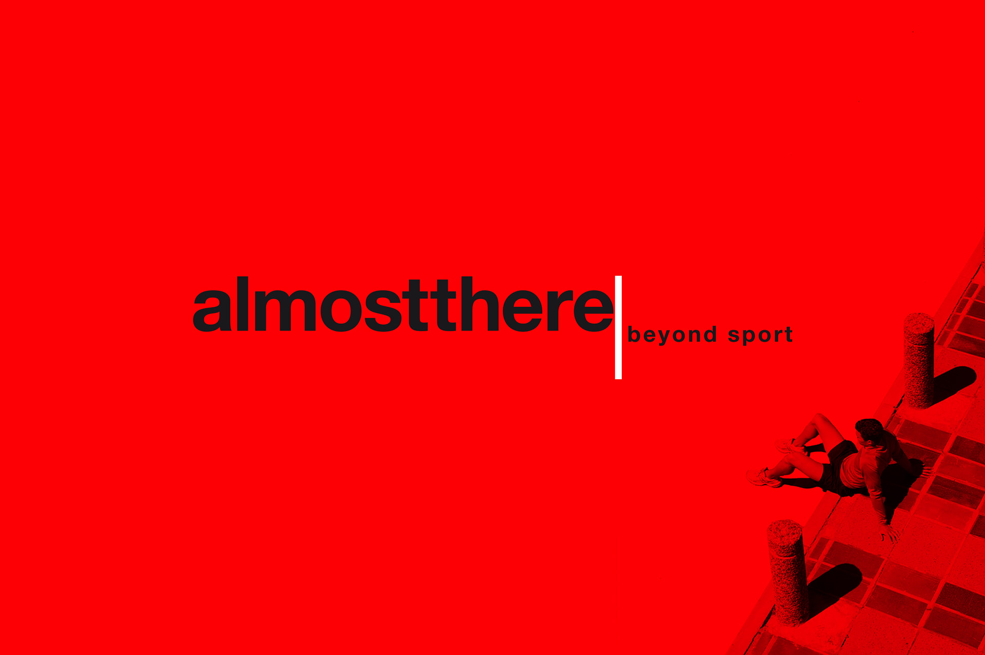
Per Almostthere, azienda di sport management, abbiamo progettato logo e brand identity. Almostthere, letteralmente, significa “quasi lì”, a un passo dal traguardo, dall’obiettivo. Ma spesso è proprio quel passo il più importante. E il logo, con il suo limit rosso che rappresenta la linea di arrivo, vuole mettere a fuoco quest’ultimo, fatidico passo. Per poi andare oltre, “beyond sport”.
For Almostthere, a sport management company, we have worked on logo and brand identity. Almostthere means a step from the finish line and your objective. Quite often this last step is the most important one. The logo, with its red limit line represents the finish line and highlights this last and decisive step to go beyond sport.